Tuesday, February 10, 2015

First week of LOAD215 complete!

One down, three to go. I must admit, I've gotten very little sleep, but I'm still functioning so that's good! I'm pretty happy with what I've done so far. Some are more inspired than others, some will need a little tweaking when this is all over, some have made it JUST under the wire timewise; but I'm seven for seven and on a roll. Here are my Week 1 layouts:


Now on to Week 2...thanks for looking!

Monday, January 26, 2015

LOAD215 Blog Hop! Some advice for newbies...


Welcome! So glad you've hopped over here! This is LOAD #10 for me, and I'm really looking forward to it. I haven't done much scrapbooking since November, so I'm ready for a jumpstart, and LOAD is a great tool for that.

As "seasoned" LOADsters, some of my colleagues and I have been asked to share a bit of advice for newbies. What do I wish I'd known before I started?

Well my first bit of advice is, take it one day at a time. On day 1 (and before), don't worry about having to do 28 layouts; just concern yourself with doing ONE layout today. Relax and take one day at a time. Planning ahead is not bad per se, but it can be overwhelming.  I prefer to just take each day's prompt and use it for that day's layout.

Secondly, don't feel that you need to prepare ahead of time. If you prefer to prepare, you can look through your photos, get photos printed, and think of things about which you'd like to scrapbook. But don't feel that you must do this. I tried to prepare a bit before my first LOAD, but found that I really didn't do much with those photos and ideas. I preferred to follow the prompts, since they triggered stories that I wouldn't otherwise think to tell.


I really enjoy the prompts, which leads me to my next bit of advice: TRY to follow the daily prompts. I have found the prompts to be very inspiring, and they often remind me of things I haven't thought of in years. My childhood was a long time ago! but I've been amazed at the things I've remembered again that happened when I was very young all because of a LOAD prompt.

Also remember that prompts can be taken in any direction you choose. I tend to look at the prompt right away in the morning (or just after midnight if I'm still awake) and then think about it throughout the day and write down any thoughts or ideas I have. I let my thoughts take me in lots of different directions when I create my layout. If you're like me, sometimes my layout will have an obvious connection to the prompt, but sometimes there is a chain of thought that leads a long way from the original. Either way it's okay - don't stress over it - you're telling your stories the way that you want to.

Of course this also leads me to #5: If the prompt for a particular day really doesn't resonate with you, then ignore it and scrapbook whatever you'd like. There are no LOAD police saying that you have to stay on-prompt.

A couple more quickies:
If you miss a day, oh well...it's not the end of the world, and don't let it derail you. Do today's layout and move on. If you want to go back and fill in later, you can; if you don't want to, that's okay, too. Whether you end up with one layout or 28 (or more!), it's more than you started with! My first LOAD actually took me three months to finally finish, and my second never did get totally done (which is fine!).

Remember that every layout does not have to be a masterpiece, and simple can often be just as good as can complicated. Get it done today. If it really bothers you, you can always go back later and add more or tweak it a little. I'll often go through all of my layouts at the end of the month and make little changes here and there; but often the things that bothered me at the time end up really not being that big of a deal! I have very few layouts from my LOADs that I really don't like (I'm talking one or two out of a couple hundred!).

Okay, I've been long-winded enough. Hopefully my fellow LOAD bloggers will fill in things I missed, and I'm sure they'll have a lot of ideas I've never thought of. (I'm planning to take a tour through, also, to see what new tips and tricks I can pick up!)

But I'll leave you with one last bit: Have fun! We all have enough stress in our lives; this doesn't need to be another. Challenge yourself, but then do what you can and enjoy the process.

Oh, and P.S. Join in the community at Flickr and participate when you can. There's a ton of inspiration and support from our wonderful community, and it's nice to get a pat on the back, too!

For great advice from other experienced LOADsters, check out this blog post by Lain Ehmann, where you'll get ideas from our fearless leader and links to the other blogs.

Saturday, January 24, 2015

Catching up (results from LOAD1014) and looking ahead...

I did it! I completed LOAD 1014. And then forgot to blog about it :P So as I look ahead to another LOAD in February, I thought I'd first look back and catch up...
October was busy, with half of my time in Ohio and half in Minnesota! I started out well trying to get layouts done earlier in the day, but as life got busy I found myself again starting layouts at 10:00 at night. I do tend to work better at night, though, so I guess that's not all bad. But I didn't get much sleep! And 12-hour travel days tend to make it tough, too. At least once I was in the central time zone I only had until 2:00 a.m. to finish, so I wasn't up quite as late. I did finish on time, though, and I'm happy about that. Here is the result:
I love seeing all of the layouts together like this, and the big stack is quite satisfying. Overall it was one of my favorite LOADs, the Scrap Happy ladies that led it did an incredible job, and the "family" support was so appreciated.

The other awesome online community that I'm a part of is at Get It Scrapped. I haven't had as much time lately to spend over there, but it's a great resource for education, information, support, friendship, and just plain hanging out. Another great bunch of ladies, and SO much talent! I'm so honored to be a part of the Creative Team there. I've had layouts in several blog posts over the past few months. Check out these articles:


Also check out the other articles on the blog. There is so much great information there. Then head on over to the Forum and Gallery. Stop in, say hi, ask a question. It's a very welcoming community!

Saturday, October 18, 2014

Another LOAD and an exciting new class

I'm halfway through another layout-a-day and so far I'm on track. I think this is my ninth LOAD - wow, hard to believe! It took me a couple of times to catch on, but since the third one I've managed to at least complete all of the layouts within the month (although a few times I had to play catch-up at the end of the month). Anyhow, that's a lot of layouts!

The question often comes up in different forums about how to organize all of those layouts. For me what has worked so far is to just put my layouts into albums as I create them, so there's no particular rhyme or reason to each album. For the most part that has worked for me. But occasionally I want to find an older layout, and as the number of layouts grows, it's becoming harder and harder to remember when or for what purpose I made that layout and therefore where to find it.

So I'm starting to rethink that "organization" strategy. I'm considering rearranging my old layouts to group them by subject and loosely chronologically. It's a daunting task, though, and one I'm not sure how to tackle.

Because of this, I'm really excited about a new class that Debbie Hodge is offering at Get It Scrapped called Curated Albums. The class involves taking your best pages from the past, curating more stories, and filling in the details with new layouts, then putting them all together in a manageable-sized book. It sounds like a great way for me to deal with my hodgepodge of layouts and try to make sense of them.

This class is being offered separate from the regular Masterful Scrapbook Design membership. It runs for four weeks, starting November 4, with new class materials and also a live "office hours" session (my favorite part!) each week. Registration is open until November 9 , but the class is on sale this weekend! - 33% off through Monday, October 20.

For more information about the class and/or to register, click here. If you still have questions, you can leave a comment here and I'll try to get the answer for you, or you can go directly to the source - check out this thread on the Get It Scrapped website forum.

Friday, September 19, 2014

More layouts at Get It Scrapped (I love that place!)

I love being part of the creative team at GetItScrapped.com. We have the most awesome assignments - ones that often stretch me out of my comfort zone. Over the past week or so I've had two layouts in the posted blog articles.

The first assignment was right up my alley - making a two-page layout with a grid on one side. (Check out the article here.)

I love to use lots of photos on a layout, and this is a great design for that. It makes it so easy to display several photos in an organized way. One the first side I showcased two focal point photos that sort of "summarize" the layout, and then the grid of photos act as supporting elements.

When making a two-page layout, it helps if you can unify the two sides in some way. Of course, the photos themselves act as connectors. But in addition to that I used a strip of the Minnesota paper, flipped to the back side, along the far edge of the second page to bring the two pages together with common colors and words. I also left a strip of the kraft cardstock all the way across the top. Finally, I used common elements (arrows and hearts) and pops of color (silver) on both sides to tie everything together.

Just a tip: I only had one piece of the Minnesota paper, and I've had it for awhile, so I knew I couldn't find more. To make it work across two pages, I cut a strip off the top and flipped it to the back side (the repeated "Minnesota" was more prominent on that side). I used the same solid color (kraft) cardstock on both pages and mounted the main paper on the left hand side (which also gave it more stability since it was thin paper) and put the strip along the edge on the right hand side.

The second assignment stretched me a lot more. I was to make a layout with a "curated natural history style" - something like you would find in a natural history museum or a botanical encyclopedia. As the blog article says, "think of Dr DooLittle’s library, and you get the idea."


Most of these, of course, have very natural, muted tones and a bit of a romantic feel, unlike the bright colors and/or more masculine feel of most of my scrapbook pages, and herein was the challenge for me. Add to that the fact that it was a page about hiking with Nate, and you get the picture - I didn't want it looking too feminine.

I looked through my stash and pulled out some rather old papers from Pink Paislee for this one, and I think they worked perfectly! The muted background and vintage nature blocks give a curated feel to the page, but the brown and green tones keep it from becoming too feminine. The wood veneer embellishments from Studio Calico and especially the wood "cookie" also help and work well to keep a light, airy, natural feel but they also support the story of the page.

The script title further supports the style of the page, but coloring it a darker green keeps it from being too feminine, and the use of the small circles in the subtitle (I love those little letters that I found in the dollar section at Target!) give subtle substance to the title.

I love both of these layouts! Hope you do too :)

Leave me a comment and let me know what you think. What are your go-to styles? What are some of the styles that you find difficult? What are some scrapbooking challenges that push you outside your comfort zone?

Tuesday, September 2, 2014

PRT - how cool is this?!?

I was so honored to be invited to be a guest on Paperclipping Roundtable today - how cool is that? I've been a long time listener, so I was thrilled to be a panelist. The subject was scrapbooking as an empty nester. The discussion with Noell, Izzy, Sue Althouse, and Kelly Sill was great, and we had so much fun.

There were two layouts in particular that I referenced. The first, "Lemonade and Massages" (the source for the epidode's title) is definitely a favorite of mine. The photo is mediocre, but the story is priceless! (I tell about it on the show.)


One of the other things I talked about was my monthly family project. Each month, on a random day, I ask each of my family members to send me a photo showing something about their day - their view at work, something they're doing, somewhere they are. I then scrapbook the photos. Right now the layouts are together in an album of recent layouts, but I like Noell's idea of putting them in an album of their own. Here's the layout I did for June:


Bottom line from the podcast: Life does go on when our kids leave the nest - it can be tough, but it can also be good. Change is inevitable. We can't, and really don't want to, keep our kids young forever. They will grow up, so we just need to look for the positive and move forward.

Friday, May 30, 2014

Excited for the year ahead...

I am so excited to be continuing for another year on the Get It Scrapped creative team. The women I work with are so talented and creative and inspiring! The articles on the blog are super informative, and the community on the forums is so kind and welcoming. It's a great place to get educated and form friendships at the same time. Check out the announcement at Get It Scrapped, and while you're at it, visit the blogs of my teammates (many of them are MUCH more prolific bloggers that I!)

There's more...
To welcome the new CT team members and get to know them a bit better, pop over to the Get It Scrapped Forums and join in on the CT Trivia contest. (scroll down to CT Celebration, then click on the various CT Trivia subjects). 
We'll have a few rounds of CT trivia going on throughout the weekend to help you get to know our team a little better. And thanks to current team member Amanda Robinson of Amanda Robinson Studio and team alumnus, Jana Morton of Pixels2Passion we've got some fabulous prizes for a few lucky winners.

Get It Scrapped has also joined Instagram, so to kick off the "new year" they're having a photo challenge. It's nice, because it's not necessarily a daily thing, but one that you can do when you have time throughout the month - sort of a scavenger hunt! And there's a prize for one lucky participant :) Check it out here: http://debbiehodge.com/home/wp-content/uploads/2014/05/GISPhotoChallenge01.pdf

The blog at Get It Scrapped is free, but there is also a membership available which gets you access to all of their incredible classes at Masterful Scrapbook Design. Whether you're a new OR experienced scrapbooker, if you want to take your design skills to a new level this is definitely the place to learn - so much information presented in a really easy-to-learn manner! AND if you sign up by June 2nd there's a special offer. 


Check out all of the details for everything going on at Get It Scrapped.

Friday, February 7, 2014

A Non-digi-Scrapbooker's Guide to Creating your own Photo-a-Day template for January

My poor blog has been so sorely neglected, but I'm back for another LOAD (LayOut-A-Day) month and had several questions as to how I created my layout for Day 6. I started to leave a really long comment on Flickr, but then decided that it would work better if I could show a bit more, so it was a good excuse to get back to my blog! Here's my layout, so that you know where I'm heading:

Capture Your 365 - Jan 2014


First let me say, there are probably templates like this out on the internet somewhere. But honestly if you have even a little bit of knowledge on using Photoshop Elements (or Photoshop), it may be faster to create your own than to spend time searching! This is digi and pretty easy to create. I used Photoshop Elements 12 (PSE12), but this can definitely be done with earlier versions (unless you have a REALLY old one that doesn't use layers). And although I'm far from an expert, I was working in "Expert" mode (this might be unique to PSE12). I also turned on the grid and enlarged the view so I could see the top corner better.

1) I started with a 12x12 canvas. (File>New>Blank File, then chose 12"x12")
2) Using the rectangle tool,  create one 2x2 square in the top left corner, then copy that square five more times. (Layer>Duplicate Layer>click OK - you can rename it here or later. There are shortcuts, too, but I want to keep this simple.)


3) Move the squares across the top of the canvas. And just to make sure they are lined up, selected all six and Align the Tops and Distribute using the Middle (horizontal centers).
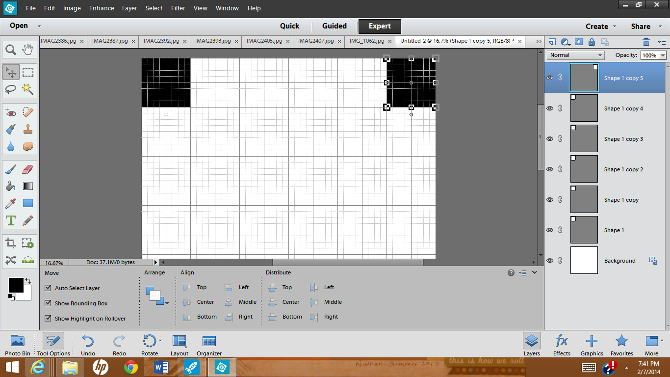
 (at this point I renamed my layers just to make things easier for me). 

 4) Select all six layers and copy those, then move the whole group below the first row.
 
You now have two rows of 6 squares across.

At this point you may want to recolor alternating blocks with a different color - it's not really necessary, but it makes it easier to see exactly where you're adding the photos later on. (Make sure that blocks bordering each other are different colors, like a checkerboard.)


5) Next select all twelve blocks and copy those again and move that group below the second row. You should now have four rows for photos.


6) Go back to the third row and copy those six blocks (so the colors are in the right order) and move them below the 4th row.
 
 (That last group of layers are probably in between rows 3 and 4 so you may want to move the layers to the top of the list - it's not critical, but easier to keep things straight. [The previous photo shows the layers already moved.])
 
7) And finally choose one block to put on the bottom row for the 31st photo.
 

 8) Once you have the basic template done, SAVE IT (in case you want to use it for next month!)
 Then go and open the photos you want to put on your layout. (At this point you can also turn off the grid [Ctrl-'] since you won't really need it anymore...I didn't think of it until later.)
 
9) To add your photos to the layout, start with the top block (the first layer above the background) and select that layer by clicking on the layer in the Layers Panel or by just clicking on the block in the layout.
 

Then open the Photo Bin and single-click on the first photo you want and drag it up to your layout. (And yes, I'm shamelessly showing off pictures of my adorable 3-month-old grandson!!)
 
Move it over the first square and resize it until it fits the way you want it to and click the green checkmark (or click the red circle thing if you want to start over with resizing it!). Finally you'll want to "Clip" this layer to the one below it - in PSE you can use Ctrl-G (Cmd-G on a Mac?). This isn't super important with the top row, but it will make a difference in lower rows if your picture isn't already square.

10) Repeat this process for all of the rest of the squares by clicking on a Layer (or block), selecting a photo from the Photo Bin, moving it onto the canvas, resizing the photo, and clipping it to the layer below.

(Here's where I finally thought to turn off my grid :P)

You can actually fill in the squares in any order. Just select the layer you want and then move the photo in - Photoshop will automatically put the photo in a layer just above the one you've selected
.
 
The last thing I did was select the background layer (all the way at the bottom of the list), chose the "bucket tool" and filled in the background with black.
 
I also wanted a thin border around the edge, so I switched back to the "move tool," selected ALL of the layers except the background (click on the first layer, then Shift-click on the last layer to select everything in between), and made the whole thing just slightly smaller and centered it on the canvas.


I added my title (using the Text tool) and it was done!

Writing the directions took way longer than creating the layout! It looks long, but it's really quite simple, particularly if you know anything about PSE. And once you've created one template, you can adapt these directions to any size photo or grid that you want. I wish I could just show you, but I couldn't figure out how to create a video :/

Try it out and let me know what you think. If you have any questions, leave me a comment below and I'll try to help. I'm not super experienced with Photoshop, but I have worked with templates a bit and I'd be happy to share what I know.

Wednesday, August 14, 2013

Have you taken inventory lately?

I know it may be strange, but I noticed one day (probably after tripping over some of them) that the shoes in our house tell a lot about who's home and who's not. My boys have always gone barefoot in the house and as soon as they walk in the back door, they take their shoes off. So if they're home their shoes are in the kitchen; if their shoes aren't there, they're not home. This summer there tend to be a lot of shoes by our back door because Nathan and Zack are home for the summer - Yeah!!
So when I was assigned a layout with the subject of "Inventory" for Get It Scrapped, I knew this would be perfect. As I started to put it together, I decided that since I had several photos I would keep things simple and let the shoes speak for themselves - by using speech bubbles, of course! I had a bunch of speech bubbles from Studio Calico and I used some of those. But I also needed more that were, perhaps, a different color or needed to be pointing in a different direction; so I also cut some of them freehand - really very simple! I also outlined all of them to give a little more definition and punch and also to make them all a bit more cohesive. Here's the result:


My favorite one is the "shoe graveyard" on our back porch. It does get out of hand at times, and sometimes I'm annoyed by the mess. But then I remember that like most kid messes, it won't always be there...and then I'll be sad (sort of :P). In a few short weeks the pathway into the house will again be clear---not necessarily a good thing, since it will mean that summer is over and the boys have gone back to Minneapolis for college. But I know that, at least for a little while longer, it will return again at Christmas time :D

Check out how other designers at Get It Scrapped have interpreted this assignment in this article: Ideas for Scrapbooking Inventory Photos that Record Your Everyday Life. There are some very clever ways to take inventory.

Then leave me a comment - what do your things say about YOUR life?

Friday, August 9, 2013

I was charged with scraplifting...

No, really - my assignment for Get It Scrapped was to scraplift myself, that is to take a layout I had previously done and use that as my inspiration for a new scrapbook page.  I could use the design layout, an element of the page, color inspiration, whatever. The hard part was choosing a layout; I had several scrapbook pages that were candidates as ones I particularly liked. But I finally decided on this layout about Aaron:

Original layout
This was a fun layout I did right after he bought this HUGE Lego set - it was his graduation gift to himself when he earned his Master's degree. I was with him when he purchased it, and the whole experience was a lot of fun as he was the envy of every guy (young and old!) in the store.

Besides the story and the basic design, one of my favorite things about this layout was the Simple Stories patterned paper I used. I loved the arrows and banners printed along the edge, and I knew that I could get a similar look by using strips of various washi (decorative) tapes. So when the same son asked his girlfriend of 5-1/2 years to marry him, I decided to scraplift this design to create a layout documenting this special event. 
Scraplifted layout


Fortunately Aaron had planned ahead and had his brother and sister-in-law nearby to take pictures of the proposal. (In fact, they were e-mailing pictures to me as it happened!) With the second layout I wanted a soft, romantic feel. This was a little tricky since the colors in the photos were quite bright, so to balance the contrast between the soft background and the bright photos I used a mix of muted and dark washi tapes. Since I knew that the darker and brighter tapes would be the first to draw the viewer's eye, I concentrated those in the vertical center of the page, pointing towards the photos. I also highlighted a few of the photos by framing them with subtle vellum frames.

It's easy to see from this that the same basic design can yield two very different looks. The basic framework is the same on both pages, but by changing the colors, photos, and story, and making some adjustments for more photos and less journaling, I could create two pages that are unique.
For more information about these layouts and to see how other designers approach their scraplifting process, check out this article at Get It Scrapped: "14 Scrapbookers Lift Their Own Scrapbook Designs and Show You How"

Just a note about the final layout: I love the new vellum-type photo frames (these are from Basic Grey), but I didn't have one large enough for my focal photo, so I cut my own from patterned vellum and darkened it slightly with Distress Ink so that it would coordinate better with the others. I also altered the purchase ones just a bit to cover some colors that didn't coordinate, and I flipped them over to the "wrong" side so that they were matte instead of shiny. Finally, for the smallest frame I used a stamp from Studio Calico on vellum to frame Kylie's beautiful engagement ring.

Saturday, August 3, 2013

Time to Get a "Real Job"

Cityscapes are one of the newest trends in scrapbooking. One of my first assignments for the Get It Scrapped Creative Team was to make a layout using the cityscape trend in an interesting way (something other than a photo of a city skyline). Check out this article, Scrapbooking Ideas for Using the Trendy Cityscape Motif, showing my take on the assignment along with other Creative Team members' interpretations. It's fun to see how different designers with different styles interpret the assignment so differently.
For my assignment I knew that I wanted to do a layout about my oldest son, Aaron, entering the "real world" workforce on a full-time basis for the first time. I'm so proud of his accomplishments and wanted to brag on him just a bit :) So many college graduates have difficulty finding a full-time job in their field, either because the market is bad or because they still really don't know what they want to do. So I think it's pretty awesome that he was able to get a couple of good job offers and was able to choose one that he feels suits him well in a company that has done well at weathering the ups and downs of the economy. Aaron will be working as a structural engineer - that is, designing buildings and other structures - and he will be working in the Twin Cities (MN), so I felt that a cityscape background was very appropriate. I know that there are several patterned papers that show cityscapes, but I decided to make my own background paper. My background would show the impression of a city without being very specific to any one city. I've used this technique in the past with other shapes and knew it would work well here. So here is what I did:
As you can see, I did experiment a bit first on plain cardstock and I loved how it turned out, but I decided I wanted to use a subtle print as my base. I have some grid papers from Studio Calico that I just love (I love graph paper and shapes in general); I chose one that had straight and diagonal lines that reminded me of the connectors that Aaron was designing during his internship. The pattern is dark enough to add interest, but also subtle enough to work with my stenciling. I left off the triangles at the top - it was supposed to be another bridge but I felt it looked more like pyramids.

 Once I completed my layout I added windows on some of the buildings. I felt that it needed something because it seemed to me that the cityscape was a little lost (I wish that I'd made the buildings just a bit taller) and the windows were just the thing. I only put them on some of the buildings, partly because I was lazy! but more because I wanted to keep the attention centered on the photos and journaling, and really only a few were needed to create the impression of the cityscape. Here is my final layout:


Just a note: When I did the experimenting I used a Colorbox cat's eye shaped chalk ink pad (since that's what I had handy). Although I kind of liked the subtle streaks that it produced, it was harder to hang onto so a couple of times it was pulled out of my fingers - that's what created the dark splotches - and before too long the pad pulled apart from the base. So for my final layout I used Distress Inks (I blended Black Soot and Iced Spruce) on an ink blending tool (from Ranger) and that was much easier to handle. I really think it could be done with pretty much any ink pad as long as you're sure to start on the template. Different pads would probably produce different amounts of streaking (which could be cool) but for the smoothest result I think the ink blending tool works best.

Friday, July 12, 2013

Inspired by Art Deco - my first layout for Get It Scrapped!

I'm so excited to be able to share my first Creative Team assignment published at Get It Scrapped! The assignment was to create a layout inspired by some aspect of art deco design. I love the art deco style, especially the architecture, so I knew that it would be easy to find inspiration there. I immediately knew that I wanted to do a layout about Cleveland's West Side Market. My son Aaron and I had recently visited there when he was home for a couple of weeks, and I had some really great pictures that I wanted to showcase.

Pinterest was a great source for art deco images, and as I browsed the images several trends became apparent: a lot of metals mixed with black and/or bright colors; symmetrical designs with clean, geometric lines; unique typefaces. I wanted to include a lot of small photos, but also needed to keep it very clean and streamlined to reflect the art deco style.

I chose to use this piece as my primary source of inspiration: http://how-do-it.inf...o_texture_idea/. By using a design such as this, keeping the layout symmetrical and the elements in strict vertical lines, I knew I could use many photos without it looking chaotic. I used solid cardstock in colors that kept popping up in the Pinterest galleries - blue, accents of red, and silver outlined in black - to keep the focus on the photos and the story I wanted to tell. Here is what I came up with:


For more information about my layout and art deco design and to see how other designers used their art deco inspiration, check out the article, Scrapbook Page Design Inspired by the Art Deco Style at Get It Scrapped.

Friday, June 14, 2013

Attending Office Hours

     I've been very busy lately with creating layouts for Get It Scrapped, but I can't show those yet. You'll have to check back in a few weeks to see what I've come up with, but I will say, I love the layouts! Between Get It Scrapped's weekly articles, the design classes (there and at Masterful Scrapbook Design), the galleries, and their Pinterest boards, there is SO much inspiration to be found! Although I was a bit stressed out (there are some incredibly talented ladies on this creative team!), I have one month under my belt and feel a bit better now.
     Anyhow, despite the fact that I can't share my assignment layouts yet, I have also been attending most of the webinars and "office hours" that are included in Masterful Scrapbook Design's bimonthly seminars. This month's seminar was "Make It Mean" and focused on really adding meaning to a scrapbook page through journaling, of course, but also with the other elements on the page such as photos, embellishments, title, etc. -- making all aspects of the page support and enhance the overall message of the page to give it more meaning. (Click here to view more details) THESE. ARE. AWESOME! Besides getting to "hang out" with talented and knowledgeable ladies, it's so interesting to listen to the contributing designers and find out why they designed a layout in the way they did. And during Office Hours, anyone who wants to can share a layout to get helpful critiques, suggestions for improvement, help when they're stuck for ideas, or just to show what they've done. It's a no-stress, supportive environment, but if you want it to, it goes beyond just the "nice layout" comments; Debbie Hodge, the guest instructor(s), and the other attendees discuss not only what they like but why they like it (and knowing the 'why' helps to apply the same principles in the future!), and if you want (but only if you want) they'll also give suggestions for improvement. And the awesome thing is, they do it without forcing their particular style on anyone else; instead they give suggestions that work with any style.
     Can you tell that I'm hooked??? My favorite Office Hours so far took place yesterday. It featured the awesome Emily Pitts and Paula Gilarde - okay I'm partial to them since they taught the Guided Design Critique Workshops of which I was a part, but they are so good at explaining the what's and why's of what makes a great layout, and I've learned a ton from them. Despite some rare technical difficulties and an outburst from me (I was actually talking to my son about a deer in our backyard but didn't realize that my microphone had been turned on at just that second!) which hopefully was edited from the recording (insert embarrassed face!), it was an awesome session. They always have such helpful ideas for tweaking a good layout and making it great, and this session was no exception! I was able to share a layout of mine, which incidentally was inspired by an inspiration challenge on Paula's blog - a design and layout I've had in mind to do for several weeks and finally put together. Here's the original layout I shared, which I think was pretty good:


It went together very quickly and certainly told my story, but I knew it could use a few adjustments. Based on the critiques I received, here is the final layout - not much different, but definitely better. For instance, I love these Thickers from American Crafts that I used for the title, but they were a bit difficult to read; so I cut little slits in the e's, f, and g and now they are much more readable. (Just goes to show that you don't have to settle for exactly what you get in letters - they can be colored, cut, combined, and altered in lots of ways to make them fit your purpose.)


It often helps to have someone else look at it with fresh eyes. They'll point out things to change that I'll think, "Duh, why didn't I see that? - now it's so obvious!"

Click here to check out Get It Scrapped...you can even get a free e-book to get started and get a feel for what they have to offer! Also check out Masterful Scrapbook Design for the "Make It Mean" and other seminars - monthly, 6-month, and 12-month subscriptions, as well as back issues, are available.

Saturday, June 1, 2013

Get It Scrapped CT Blog Hop


Hello and welcome to the Get It Scrapped Creative Team Blog Hop!

 I am SOOO excited to announce that I will be joining the Get It Scrapped Creative Team beginning today, June 1st. This is my first creative team position, so I must admit that I'm a little nervous about the whole thing, but I'm also super excited! And I think that this is a great place to start. I love the Get It Scrapped/Masterful Scrapbook Design community because it feeds my desire to learn and grow. There is so much incredibly meaty information at these two websites and so many opportunities to receive feedback and constructive help.

For instance, do you struggle with how to include journaling on your scrapbook page? When it comes down to it, one of my main reasons for scrapbooking is to record stories and memories, so that requires journalling. I could just put it onto the page anywhere there's room, but I like it much better when it fits in with the overall design of the page. This article from Get It Scrapped, 5 Ways to Make Scrapbook Page Journaling A Dynamic Part of Your Visual Design, discusses making journaling a part of the page design, and it gives some awesome ideas and examples. I've tried to incorporate these ideas in all of my pages lately, and here's just one example:


(Yup, that's me when I was about 6 years old.) I also took inspiration from one of the Get It Scrapped Pinterest inspiration boards (Inspo: Covers Book & Magazines) and used this book cover as my starting point. Although the  book cover doesn't look much like the final layout, you can see hints of it in the vertical column of the poem and photo.


I'm also excited that I get to offer you a discount on the Typography issue from Masterful Scrapbook Design - how cool is that??

Save 60% off of the Masterful Scrapbook Design Issue – Typography


Join guest teachers Anna Aspnes, Paula Gilarde, Emily PItts, Lisa Dickinson, and Tiffany Tillman as they show how to
use type as focal point, embellishment, title, and backdrop, and give you ideas and how-tos for both paper and digital scrapbook pages. Learn from these designers who rock the typography on their own scrapbook pages.
 

Use coupon code giscttsmf60p to grab this issue for 60% off thru midnight ET June 3rd
***Just place the Typography issue of Masterful Scrapbook Design in your cart and apply the coupon code above.***


For more ideas and discounts from the Get It Scrapped Creative Team keep on hopping, using the links below!


Enjoy your weekend!!!