Showing posts with label collage. Show all posts

Saturday, January 24, 2015

Catching up (results from LOAD1014) and looking ahead...

I did it! I completed LOAD 1014. And then forgot to blog about it :P So as I look ahead to another LOAD in February, I thought I'd first look back and catch up...
October was busy, with half of my time in Ohio and half in Minnesota! I started out well trying to get layouts done earlier in the day, but as life got busy I found myself again starting layouts at 10:00 at night. I do tend to work better at night, though, so I guess that's not all bad. But I didn't get much sleep! And 12-hour travel days tend to make it tough, too. At least once I was in the central time zone I only had until 2:00 a.m. to finish, so I wasn't up quite as late. I did finish on time, though, and I'm happy about that. Here is the result:
I love seeing all of the layouts together like this, and the big stack is quite satisfying. Overall it was one of my favorite LOADs, the Scrap Happy ladies that led it did an incredible job, and the "family" support was so appreciated.

The other awesome online community that I'm a part of is at Get It Scrapped. I haven't had as much time lately to spend over there, but it's a great resource for education, information, support, friendship, and just plain hanging out. Another great bunch of ladies, and SO much talent! I'm so honored to be a part of the Creative Team there. I've had layouts in several blog posts over the past few months. Check out these articles:


Also check out the other articles on the blog. There is so much great information there. Then head on over to the Forum and Gallery. Stop in, say hi, ask a question. It's a very welcoming community!

Friday, September 19, 2014

More layouts at Get It Scrapped (I love that place!)

I love being part of the creative team at GetItScrapped.com. We have the most awesome assignments - ones that often stretch me out of my comfort zone. Over the past week or so I've had two layouts in the posted blog articles.

The first assignment was right up my alley - making a two-page layout with a grid on one side. (Check out the article here.)

I love to use lots of photos on a layout, and this is a great design for that. It makes it so easy to display several photos in an organized way. One the first side I showcased two focal point photos that sort of "summarize" the layout, and then the grid of photos act as supporting elements.

When making a two-page layout, it helps if you can unify the two sides in some way. Of course, the photos themselves act as connectors. But in addition to that I used a strip of the Minnesota paper, flipped to the back side, along the far edge of the second page to bring the two pages together with common colors and words. I also left a strip of the kraft cardstock all the way across the top. Finally, I used common elements (arrows and hearts) and pops of color (silver) on both sides to tie everything together.

Just a tip: I only had one piece of the Minnesota paper, and I've had it for awhile, so I knew I couldn't find more. To make it work across two pages, I cut a strip off the top and flipped it to the back side (the repeated "Minnesota" was more prominent on that side). I used the same solid color (kraft) cardstock on both pages and mounted the main paper on the left hand side (which also gave it more stability since it was thin paper) and put the strip along the edge on the right hand side.

The second assignment stretched me a lot more. I was to make a layout with a "curated natural history style" - something like you would find in a natural history museum or a botanical encyclopedia. As the blog article says, "think of Dr DooLittle’s library, and you get the idea."


Most of these, of course, have very natural, muted tones and a bit of a romantic feel, unlike the bright colors and/or more masculine feel of most of my scrapbook pages, and herein was the challenge for me. Add to that the fact that it was a page about hiking with Nate, and you get the picture - I didn't want it looking too feminine.

I looked through my stash and pulled out some rather old papers from Pink Paislee for this one, and I think they worked perfectly! The muted background and vintage nature blocks give a curated feel to the page, but the brown and green tones keep it from becoming too feminine. The wood veneer embellishments from Studio Calico and especially the wood "cookie" also help and work well to keep a light, airy, natural feel but they also support the story of the page.

The script title further supports the style of the page, but coloring it a darker green keeps it from being too feminine, and the use of the small circles in the subtitle (I love those little letters that I found in the dollar section at Target!) give subtle substance to the title.

I love both of these layouts! Hope you do too :)

Leave me a comment and let me know what you think. What are your go-to styles? What are some of the styles that you find difficult? What are some scrapbooking challenges that push you outside your comfort zone?

Friday, February 7, 2014

A Non-digi-Scrapbooker's Guide to Creating your own Photo-a-Day template for January

My poor blog has been so sorely neglected, but I'm back for another LOAD (LayOut-A-Day) month and had several questions as to how I created my layout for Day 6. I started to leave a really long comment on Flickr, but then decided that it would work better if I could show a bit more, so it was a good excuse to get back to my blog! Here's my layout, so that you know where I'm heading:

Capture Your 365 - Jan 2014


First let me say, there are probably templates like this out on the internet somewhere. But honestly if you have even a little bit of knowledge on using Photoshop Elements (or Photoshop), it may be faster to create your own than to spend time searching! This is digi and pretty easy to create. I used Photoshop Elements 12 (PSE12), but this can definitely be done with earlier versions (unless you have a REALLY old one that doesn't use layers). And although I'm far from an expert, I was working in "Expert" mode (this might be unique to PSE12). I also turned on the grid and enlarged the view so I could see the top corner better.

1) I started with a 12x12 canvas. (File>New>Blank File, then chose 12"x12")
2) Using the rectangle tool,  create one 2x2 square in the top left corner, then copy that square five more times. (Layer>Duplicate Layer>click OK - you can rename it here or later. There are shortcuts, too, but I want to keep this simple.)


3) Move the squares across the top of the canvas. And just to make sure they are lined up, selected all six and Align the Tops and Distribute using the Middle (horizontal centers).
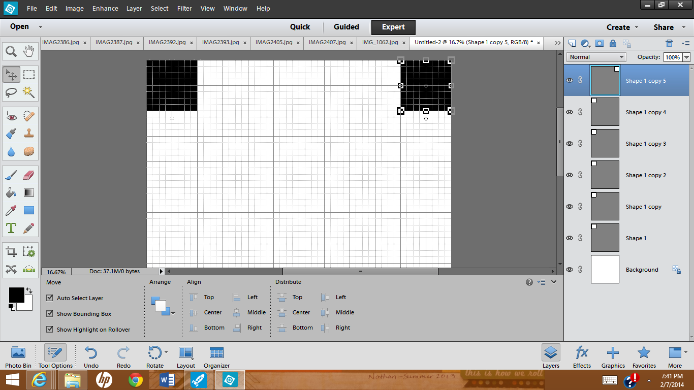
 (at this point I renamed my layers just to make things easier for me). 

 4) Select all six layers and copy those, then move the whole group below the first row.
 
You now have two rows of 6 squares across.

At this point you may want to recolor alternating blocks with a different color - it's not really necessary, but it makes it easier to see exactly where you're adding the photos later on. (Make sure that blocks bordering each other are different colors, like a checkerboard.)


5) Next select all twelve blocks and copy those again and move that group below the second row. You should now have four rows for photos.


6) Go back to the third row and copy those six blocks (so the colors are in the right order) and move them below the 4th row.
 
 (That last group of layers are probably in between rows 3 and 4 so you may want to move the layers to the top of the list - it's not critical, but easier to keep things straight. [The previous photo shows the layers already moved.])
 
7) And finally choose one block to put on the bottom row for the 31st photo.
 

 8) Once you have the basic template done, SAVE IT (in case you want to use it for next month!)
 Then go and open the photos you want to put on your layout. (At this point you can also turn off the grid [Ctrl-'] since you won't really need it anymore...I didn't think of it until later.)
 
9) To add your photos to the layout, start with the top block (the first layer above the background) and select that layer by clicking on the layer in the Layers Panel or by just clicking on the block in the layout.
 

Then open the Photo Bin and single-click on the first photo you want and drag it up to your layout. (And yes, I'm shamelessly showing off pictures of my adorable 3-month-old grandson!!)
 
Move it over the first square and resize it until it fits the way you want it to and click the green checkmark (or click the red circle thing if you want to start over with resizing it!). Finally you'll want to "Clip" this layer to the one below it - in PSE you can use Ctrl-G (Cmd-G on a Mac?). This isn't super important with the top row, but it will make a difference in lower rows if your picture isn't already square.

10) Repeat this process for all of the rest of the squares by clicking on a Layer (or block), selecting a photo from the Photo Bin, moving it onto the canvas, resizing the photo, and clipping it to the layer below.

(Here's where I finally thought to turn off my grid :P)

You can actually fill in the squares in any order. Just select the layer you want and then move the photo in - Photoshop will automatically put the photo in a layer just above the one you've selected
.
 
The last thing I did was select the background layer (all the way at the bottom of the list), chose the "bucket tool" and filled in the background with black.
 
I also wanted a thin border around the edge, so I switched back to the "move tool," selected ALL of the layers except the background (click on the first layer, then Shift-click on the last layer to select everything in between), and made the whole thing just slightly smaller and centered it on the canvas.


I added my title (using the Text tool) and it was done!

Writing the directions took way longer than creating the layout! It looks long, but it's really quite simple, particularly if you know anything about PSE. And once you've created one template, you can adapt these directions to any size photo or grid that you want. I wish I could just show you, but I couldn't figure out how to create a video :/

Try it out and let me know what you think. If you have any questions, leave me a comment below and I'll try to help. I'm not super experienced with Photoshop, but I have worked with templates a bit and I'd be happy to share what I know.